Chart of the Day: Five Years in Real Estate
Contents
About the Author

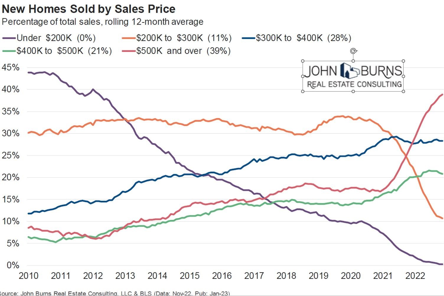
Today’s Chart of the Day comes from John Burns and shows the historical percentages of homes sold by sales price going back to 2010.
As you would expect, over time the cost of new homes is going up. This is evident by the long, slow decline of homes that cost $200K or less: 45% of homes sold in 2010 to 0% in 2022. However, I was surprised by the sharp drop in homes sold in the $200K to $300K range: 35% before the 2020 pandemic to only 11% in 2022.
In five short years, we went from just under half of new homes costing $300K or less to only one out of ten.
Samuel serves as Senior Vice President, Chief Investment Officer for the Crews family of banks. He manages the individual investment holdings of his clients, including individuals, families, foundations, and institutions throughout the State of Florida. Samuel has been involved in banking since 1996 and has more than 20 years experience working in wealth management.
Investments are not a deposit or other obligation of, or guaranteed by, the bank, are not FDIC insured, not insured by any federal government agency, and are subject to investment risks, including possible loss of principal.